A highly misleading graph has been floating around the Internet these past few days. This graph purportedly shows that there’s been a huge drop in the percentage of hospitalized COVID-19 patients who die from the disease.
I would love nothing more than for this to be true. Unfortunately, the graph is highly deceptive, as I will show below. First, let me say that if we set aside this graph for a moment, there is some good news to report: it does seem that our doctors are getting better at helping us fight this disease. This is discussed in more detailed in the New York Times piece I linked to in my prior blog post. Based on this reporting, I suspect mortality has dropped a bit among those hospitalized. However, the improved outlook is probably not nearly as dramatic as the misleading graph would indicate.
So let’s dive into analyzing the graph. Here it is:
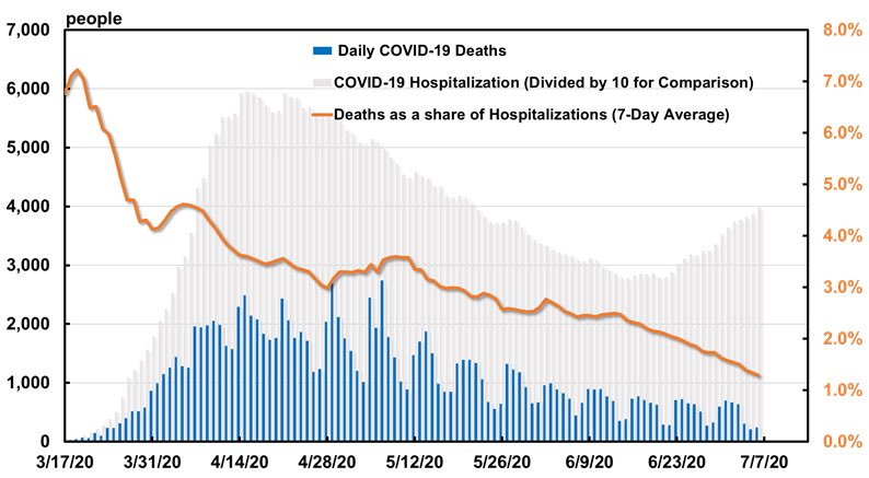
The graph appears to have been made by Brian Wesbury (Chief Economist at First Trust Portfolios LP), who indicates here the data was obtained from The COVID Tracking Project (the same data source I use for most of what I’ve done on this site).
As soon as I found out that COVID Tracking Project data was used to create this graph, I knew there was probably a major problem. The folks at The COVID Tracking Project are doing a wonderful job providing the best data they can to the public, but as they’ve noted several times, their hospitalization data is incomplete because they have to rely on whatever data the states themselves make available. This wouldn’t necessary be a huge problem for the graph, except that there’s been a gradual increase in the number of states reporting hospitalization data over time. What that means is that the numbers shown in the graph above dramatically undercount hospitalizations in the early days shown on the graph (March and April), but the hospitalization data is gradually getting more filled in as time passes (hence, deaths go down relative to hospitalizations).
Here’s one example of how the graph above is so misleading: From March 17-21, only one state (New York) was reporting current hospitalizations. But most or all states were reporting deaths. So when the creator of the graph above calculated that the number of deaths during this time was about 7% of the number of hospitalizations, they were actually showing that the number of deaths throughout the whole country was equal to about 7% of the number of hospitalizations in New York. By comparison 31 states reported at least one death during this time period when only New York was reporting current hospitalizations. That’s not right to compare deaths from 31 states to the number of hospitalizations from 1 state, when trying to figure out how many hospitalized patients ultimately die.
Just to drive the point home, I want to show you two graphs I made. First, I wanted to make sure that I was using the same (or very similar data) as the creator of the original graph, in order to make sure I was understanding their data correctly. Here’s my attempt to reproduce their graph using the latest COVID Tracking Project data (it turns out that the data for my graph isn’t exactly the same (not too surprising), but it’s very, very similar):

Then, I wanted to see what would happen if I calculated the share of deaths compared to hospitalizations if I only counted deaths from states that were also reporting hospitalizations (this varies over time, so for each day, I count total deaths and hospitalizations among whatever states reported hospitalizations that day). Here’s what I get once I used the same states to measure both deaths and current hospitalizations:

This graph gives a much more honest depiction of what’s going on. But I still wouldn’t recommend using this graph to try to determine how many hospitalized COVID-19 patients end up dying for a couple of reasons.
First, there is typically a considerable delay between when people are hospitalized and when people with fatal cases of the disease die. This graph doesn’t take into account that lag between hospitalizations and deaths.
Second, it’s hard to interpret a graph that includes different states on different days! In the first few days, the plotted data only come from New York (since that’s the only state reporting hospitalizations). Then on March 22, Arkansas, Colorado, and Connecticut’s numbers are added to the graph, since they started reporting current hospitalizations on that day. Gradually, more and more states are being filled in as time passes on the graph. So it’s a weird way to plot the data.
My goal is not to try to give us a good graph to compare hospitalizations to deaths. I’ll leave that task to someone else (or another day). Right now, I just wanted to show that the graph that’s getting passed around online is highly misleading, so we should stop sharing it!
Thanks for reading. If you want to double-check any of my work (and you’re familiar with Stata), you can access all the code I used to make the graphs above here: https://github.com/favero-nate/covid-underreporting (files for this post have “deaths_to_hospitalizations” in the title).
